After a long weekend off-grid, camping in the Cascades, I’m back in the office playing with CSS and clip-path polygons. I started out following the by Drew Minns, along with the CodePen. As I was wanting to just learn how clip-path polygons are constructed I made minor changes to the original, which you can see here.

I also like the idea of using clip-paths applies to images as thumbnails or even navigation:

(I used CSS blending mode markup for the hover effect on the first image). The beauty of using clip-path is that the images can be easily changed out without needing manual editing. They could even be dynamic.
What is Clip-Path?
clip-path property in CSS allows you to specify a specific region of an element to display, rather than showing the complete area. ~ CSS-Tricks
In the example above the clip-path polygon makes the triangular indents about the navigation item when hovered over. In the next image the clip-path polygon is applied to trim parts of an image to create a comic-style text bubble.

How Do I Create a Clip-Path Polygon?
The clip path is a series of coordinate pairs, each pair separated by commas. It took me awhile to get my head around it, and this is how I envision it.
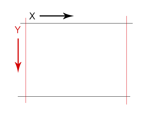
Coordinates are grouped as X Y pairs where X is horizontal axis and Y the vertical axis.

Starting at the upper right corner, the coordinates would be X0 Y0 or 0 0. The distance away from the start point increased up to 100%. The bottom right corner’s coordinate is X100% Y100% or 100% 100%.

If I were going to create a square box my clip-path would look like this: clip-path:polygon(0 0, 100% 0, 100% 100%, 0 100%). Or, in visual terms:

Note that the end of a line is also the beginning of the new line – this is automatic so you don’t have to repeat it. The object you are drawing always wants to be closed, so the last coordinate you give it will create a line to the very first coordinate of the path.

Where it gets fun is when you are creating shapes. For example, here is the clip-path for the x shape hover in the first picture of this article:
clip-path: polygon(50% 20%, 70% 0, 100% 0,100% 20%,80% 50%,100% 80%, 100% 100%, 70% 100%, 50% 80%, 30% 100%, 0 100%, 0 80%,20% 50%,0 20%, 0 0, 30% 0);
If you take some time you can see that it comes out like this in words:
- Start at the point defined by X50% Y20% and go to X70% Y0
- From there go to X100% Y0
- From there go to X100% Y20%
- and so on…
What Other Clip-Paths are there?
Besides polygon you can define a circle, ellipse and inset rectangle using clip-path. See clip-path on WPD for more information.
What Browsers Support Clip-Path?
For webkit browsers you’ll need to use a prefix. This is the CSS markup I generally use:
-webkit-clip-path: polygon(…);
clip-path: polygon(…);
Browser support also depends on the shape. Polygons are supported by all current browsers except IE (of course). The circle clip-path is only supported in Chrome, Opera and Safari. See here for more information. Fortunately it deprecates well for IE – the image will just be shown as a regular box.
- Tables That You Can Sort and Search - May 24, 2017
- Responsive Newspaper-Style Columns are Easy with CSS - May 23, 2017
- Use Tooltips to Add Context - May 22, 2017


Trackbacks/Pingbacks